brand design
Year
2024
Client
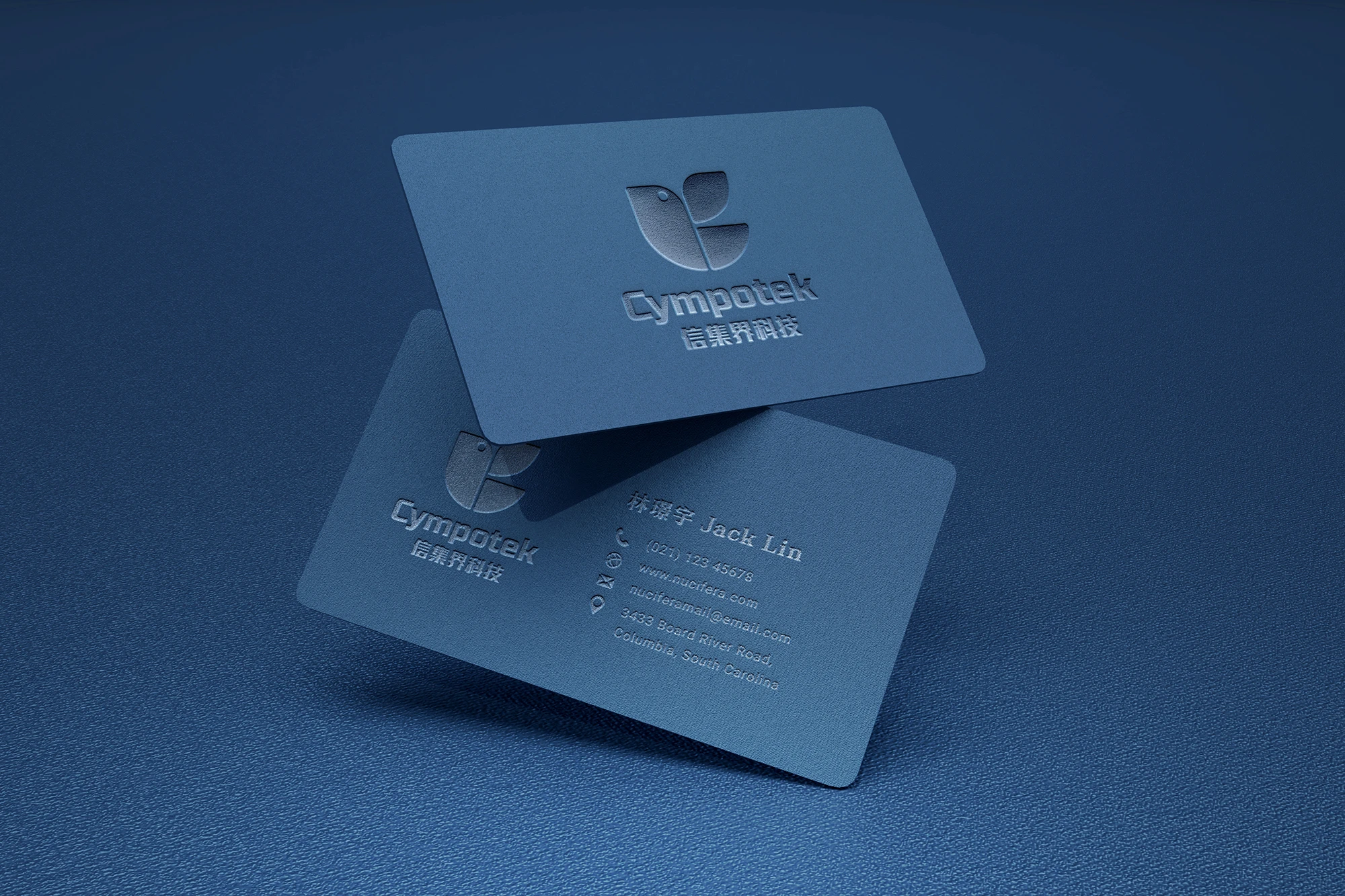
CYMPOTEK
The abbreviation "Cympotek" combined with the shape of a bird symbolizes the company's ability to soar toward a better future. The bird's flight represents progress, growth, and the company’s commitment to reaching new heights and opportunities.